1. Clarity
Yes, the literal, stylistic, and thematic messages of the piece are clearly and efficiently presented. The image is working toward the same overall message and goal of typographical conveyance. Conveyance depends on a lot on the layout of the image being presented. Using thematic and visuals connect the audience to the conveyance. By having each visual and theme of each word correspond with the words meaning, it creates an overall theme. No there is no possibility for misinterpretation of the piece's message because the words themselves tell their interpretation. For instance the word shred is overall made to seem shredded. The word is "cut up" therefore instantly giving away the meaning shred. I don't believe that there is one message fighting for attention. I think they all equally have the opportunity to catch the audience's eye. I simplified the image as a whole into one image so there was a greater impact of typographical conveyance. There was no separation because I want the audience to see the whole theme of typographical conveyance at one.
2. Audience
The target viewer for this piece is college students and professors of educational media. Any students and professors of educational media can see my work and use it as an example for their own work. Other educational media minors can look at my blog and see the typographical conveyance example and refer to it to help them understand the term themselves. The tone should be easy and efficient for the audience to grasp the concept. Overall I believe my work is easy to read and appealing for the audience to grasp the overall theme. The lingo that they could respond to typographical conveyance. Educational media minors know the term and can relate it to the image that I presented. This piece does not talk down to the audience, it simply is just helping them define what typographical conveyance is. It is a mere example of how to construct such an item for the theme. This image will not fly over there heads because I made it easy to read and understand. This image does stand apart from what the audience has already seen because it is conveying a different theme and topic then from what I already provided. If this piece were a person, they would act out the words they were given. For "shred", they would act tough while given "light" and "pillow", they would act soft and elegant. The target audience would like the person because they would embody the theme of typographical conveyance and also get another example of the concept.
3. Purpose
This piece is to use visual media to convey a meaning or mood from the observed to the observer. It is not used to sell a product but meaning to get a point across of the concept. It is to inform the audience what typographical conveyance is and how it is represented. I have discussed the purpose of this work with my professor. I had her look at my images for input and if I need to come across with more clarity with the images. The purpose of this piece has been adequately narrowed so that it can be given as much attention and power as possible. I combined all the words into one piece so there would be a heavy emphasis on typographical conveyance.
Monday, April 18, 2011
Typographical Conveyance

The purpose of this activity was to create words that also showed their meaning. For "Shred" I used Photoshop and erased some of the text to make it look like the word was shredded itself. With "lightly", I wanted to make the picture seem elegant and light, therefore made the font elegant looking and made the word almost transparent. With "atom", I used google images to search for a representation of an atom and placed it behind the word. For "brick" I used photoshop to make it seem that bricks made up the word itself. For "Pillow" I added a pillow to the background and warped the word in photoshop to make it seem as if the word was laying on the pillow itself. For "XXL" I "sphered" the word to make it enlarged and stretched out. I wanted to add the effect that it was EXTRA EXTRA LARGE. I believe I was successful in my work because each word represents the effect I gave it. Without looking at the word, I can feel the description of the word.
CAP: Connotation, Attributes, Placement
1. Connotation
The visual style of all my work ties in with a theme that I wanted it to convey. A lot of my work has to do with fonts, legibility, emotion, etc. They all surround the same topic how words and images are presented. Every sub-component is working with how words and images are presented. For instance, legibility, fonts, hue, saturation, etc. Each component carries out the theme of being a successful image and wording. The theme does not seem too specific or overly broad. It has a wide range of how successful images and wording can be. As long as its pleasing to the eye, legible, and so on. There's no specific guidelines but enough guidelines to make sure its not overly broad. Color could have been better reflected in my theme to help convey the message. If I kept an overall color then it would have probably flowed better. Yes, it would be helpful to show my work to others because peer revision is a strong, useful tool in perfecting your work. I would take any advice to help better my work.
2. Attributes
I am satisfied with the visual weight, structure, color and presentational style of my work. The blog flows nicely within the theme of images and wording. The reader can sense that my work was based on successful images. I kept all my images to the left of the text. Sometimes the blog would push the words a little funny to the side, but overall I kept the same structure and presentational style. Some images linework could have been made thicker to emphasize more emotion and more pronounced. Some of the fonts for word portraits could have maybe used more emotional spin on them. For instance Classy and Rugged could have been worked with more to make the writing define more of the word. The point of the emotion gets across, but Classy could have used more softness and Rugged could have been "roughened up" more. My backdrop of certain work outcomes could have been tied in more with their themes. A lot of pictures I left white to emphasis the fonts and wording, however, backdrops could have also created emotion among the work. Color options for all work has been explored. I used all different colors throughout my work. The color scheme could have been worked on so that there was one main theme. My work is definitely intended for broad use because my work can be used as examples for other people's work. The text is large enough for the audience to read; I did not make anything non legible for the audience. I used different fonts for every piece of my work so there was no repetition among the images and wording so the audience had something different to look at every time.
3. Placement
Throughout my work, I tried to keep the main focus on the middle of the work. The only work that does not satisfy this component is the Legibility and Safe Text Area blog. However, that blog was mainly to find a picture with a busy background and with a safe text area and that was the image that was produced. The centering of my work calls attention to itself because it's what draws your eyes to the image. The audience will notice that their eye will draw to the center of my work with every image. This element grouped all my work with aesthetic gains. Having the center of all my work the main focus, makes my work as a whole aesthetically pleasing.
Thursday, April 14, 2011
Legibility and Text Safe Areas

For this activity, we were to create legible text against a busy background. I chose a background with flowers in one corner and a text safe area up in the right upper corner. I made the background about 3% less opaque so it faded a good bit to make the words pop even more. I chose a color for the text that match that overall picture. I chose a darker color against the light sky background to make sure it was legible. I am satisfied with my turn out because even with the busy background, it is easy to read the text in the right corner .
Second Life

The assignment for this activity was to create an object in the application SecondLife. When we first started in SecondLife we created characters to represent ourselves and transported ourselves to James Madison University. We then started to build our objects. Under Build we selected "Select Build Tool" and "Create Tool". I chose the sphere and enlarged the shape. I worked with the colors and manipulated the shininess of the object. I am very satisfied with my object because I love the texture it shown with the shiny characteristics. The activity was pretty simple and easy to follow and I enjoyed SecondLife a lot.
Thursday, April 7, 2011
Logo: Combining fonts and images


The purpose of this assignment was to create a Logo by combining fonts and images. We made up a company, found matching font to the theme as well as an image. I chose my made up company as "Classy Clothes". I chose the font Harrington because of the clean lines but still having some curl to the letters. To me, the font represents classiness. Next, I incorporated the image of a hanger since that's what first popped into mind when I think of clothes. A hanger is a universal symbol associated with clothes. I believe I was successful in my work because overall the logo is universal with classy and clothes.
Tuesday, April 5, 2011
Word Portraits


The purpose of the first assignment was to choose two words that are best amplified by the "voice" of two different fonts. The first font I chose was Edwardian Script ITC. The first word that popped into my mind was "Classy". The font looked professional and more "grown up" since it took more of a cursive shape. When I think of classy, I think of the color red. For the second font, I chose Cracked. The font looked "rough housed" therefore I chose the word "Rugged". I kept the color black since black is a more manly color. I believe I was successful in my work because without reading the word, I feel the emotions come through the fonts.
The purpose of the second assignment was to choose two words that contradicted the fonts. I first chose the font Blackoak Std which had a very bold and big font type. Therefore, I chose the word "tiny" since it was the opposite of big. I chose the color yellow because yellow is sometimes a hard color to see, which contradicted the boldness of the font. The second font I chose was Helvetica Neue which was a very simple font. Therefore I chose the word "Crazy" since it contradicted the simplicity. I also changed every letter of the word to go with the crazy theme of the contradiction. I believe I was successful in my work because the emotions are clearly contradicting the fonts that are given. The words don't match the type of font.
Times Up
The purpose of this task was to take an everyday object and add emotion. I chose an hourglass as my object to create as an object that evokes emotion. I chose a target audience of college students since being a college student myself, I know time seems too short. I uploaded the hour class into photoshop and inverted the image. I then used the warp, perspective and skew transforming options to bend the hour glass as if time was getting away. I added the skid marks as if time to show that time had come to a sharp stop. I placed the scantron inside the hour glass using feathering to target the college students about studying, tests, school work, etc. I placed the words "Times Up" to the right of the picture as if the hourglass is halting before the words. I feel like I was very successful in my work because when I compare my original hour glass image to the image I created, I feel emotion in my image. I feel some panic towards the fact that time seems like its just slipping away. There are enough hours in the day.


Thursday, March 24, 2011
Tuesday, March 22, 2011
Color Activity
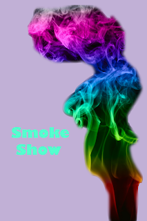
In our color activity, we chose an image with multiple colors shown. We uploaded the photo in Photoshop, eliminated the background and uploaded a new one. I used the dropper tool to select a color from my smoke image to serve as the background color. I added text to the picture, also using the dropper to use a color of the smoke image. I was successful in my outcome since all the colors used are from my original image.
Hue and Saturation
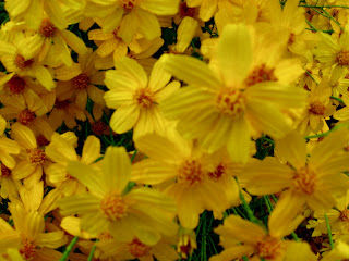
Original Image
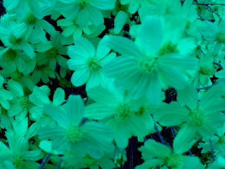
Hue Image
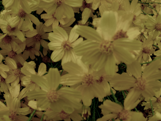 Saturation Image
Using Photoshop, I adjusted the hue to 118 to create the bluer image of the yellow flowers. I set the Hue back to zero, and adjusted the Saturation to a negative 61. Hue and Saturation have a huge impact on the image, making it different colors or taking the color from the image. I was successful in Photoshop with the Hue and Saturation and like how my photos turned out.
Thursday, February 24, 2011
Icons

The assignment was to find a visual of a simple object and create an icon image of the object. The icon should be able to represent the image strongly that you know exactly what the image represents. The visual that I chose was a picture of a fork. Just as the examples that are given in Krause's book, I highlighted the part of the fork that was the most representable. Naturally, the part of the fork that is the most recognizable is the head of the fork. Therefore, in PowerPoint, I used simple shapes to recreate the fork image. I used triangles to create the prongs of the fork, then used a trapezoid and a rectangle to finish the icon. To make the icon look more complete, I added a box around the image to enclose it. I believe my work is successful because I believe that my icon fully represents a fork. When I look at the icon, a fork comes to mind instantly.
Gestalt Principle: Closure

The principle I used was closure. With closure, you create an image by using other shapes, however the shapes do not touch. In my visual, I used the simple shape of the triangle to create a pentagon within the triangles, and even a star shape as a whole. I believe my work is successful because this is a good representation of the principle closure since the triangles do not touch in the visual, yet you can still see other shapes. I also enhanced the image by making the shapes black, so it's easier to see the other images and also gives the idea of an edge.
Tuesday, February 22, 2011
Critical Reflection
Connection:
Yes, the elements that are thematically connected are placed in association with each other visually. One activity that shows that the elements are thematically connected is the Grouping and Theme blog. I kept the same shape of a doughnut throughout the composition that shows that they are thematically connected.
Some adjustments could be made, mostly because work can always be critiqued.
The pieces do not feel scattered. Each blog and activity are grouped together and shows a logical order to each activity and blog.
The connections between certain elements should be cut off to create a visual break because that's most appealing to the eye then an intentional interruption of the flow of the piece. The descriptions flow with each other, describing step after step and finally if I was pleased with my work. Each blog post has different titles, therefore showing a visual break between each composition.
Yes, there are strong visual and thematic connections between the blog entries. They all describe composition descriptions; i.e. Horizons, Grouping and Theme, Alignment, and Color and Emphasis.
Structural connections consistently are applied since we were working on composition throughout this unit and shows unity among the blog portfolio.
Alignment:
Overall, my portfolio isn't completely aligned, each blog post has it's individual alignment. I would post the visuals to the left extreme side (flush-left) with the text on the right of the visual. I attempted to put each before and after picture on top of one another, however getting alignment exactly right in a blog post is quite difficult. I looked over my alignment again and even though it is difficult to get it perfect, I believe I did a good job aligning the visuals. There are areas of trapped space that could be erased, but then again, I attempted to delete the empty space, but then the alignment gets moved out of place. It is hard to get alignment perfect with a blog post. However, the open space does allow the blog portfolio to flow nicely and not seem too busy.
Priority:
If I were to look at this portfolio after a lunch break or across the room, it's eye catching. All the visuals that are placed onto the portfolio are interesting and make you want to read about them. Having bigger text for titles and separating titles from the visuals and descriptions highlights the hierarchy in the blog portfolio. Some of the titles could possibly be made larger to stand out, however, they do not come with a size range to fix. There is a good balance of color and value that bring attention to the subject matter by the colors in the visuals. Also, having a lighter text background allows the visuals and the text to pop on the blog portfolio. There is visual flow throughout the portfolio having the separation between each blog posts and flow within the blog posts themselves. The flow and balance of color, etc allow the eye to be directed towards the composition and not reared off the page. Your eye catches the visuals and there are no distractions among the portfolio to direct your eye away from the work.
Old and New
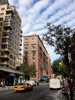
Before
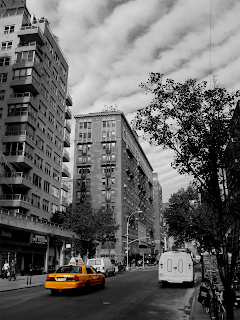
After
For our Old and New activity, we were to select a busy street visual and make the surroundings of one object color while the rest of the picture looks old with either a black and white coloring or sepia coloring. I uploaded the picture in Photoshop, magnetic lasso-ed the taxi, selected inverse and changed the Hue and Saturation as well as the Selective Color to make the background of the taxi black and white. Now, the taxi stands out a lot more than the original visual. Your eye is drawn instantly to the yellow taxi. I am pleased with my work because the color and emphasis on the yellow taxi draws the eye right away. The rest of the photo looks old while the taxi looks modern.
Color and Emphasis
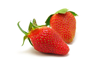 Before
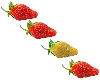
After
For our Color and Emphasis activity, I had to select a simple object to work with. I used the magnetic tool in Photoshop to only select one of the strawberries. I then created four copies of the strawberry and used free transform to edit the position the strawberry was taking. To put emphasis on an object, I had to change the color of only one of the strawberries. Therefore, you are not drawn to the position of the strawberries, but more of the color and difference one of the strawberries holds. I am pleased with my outcome because right away you are drawn to the different colored strawberry. I really like the green color I used since green and red are complimentary colors on the color wheel.
Thursday, February 10, 2011
Composition

The purpose of our work was to show alignment in our design as well as still having the object as the main focus of the image. I first uploaded a picture of a simple object. I placed text directly underneath the object as well as text on the bottom of the photo. Once I placed the text onto the image, I stretched the sides of the text boxes to extreme left and right, and clicked center alignment. I made sure that all three boxes, the image and text boxes, were all aligned by holding down the shift key. After maneuvering the boxes with the keyboard, they were finally aligned. I believe my work was successful because the image is aligned with the center of the page and the object is still the main focus of the image.
Tuesday, February 1, 2011
Grouping and Theme

Our assignment was to create seven slides with the same ten shapes, but each slide was a different description. I created these slides in PowerPoint using the basic shapes of a doughnut. We were able to change the shape and color of the shapes as long as it related to the theme of the slide. The first slide I have shown is the Logic slide. First thing that comes to mind for me when Logic is brought up is "thoughts". To me, the image linked with thoughts, is the symbol "?" simply because logic always deals with questions. I am pleased with my work because the circles strongly represent a "?" which was my goal overall.

The second image that I have is the Anarchy slide. When I looked up Anarchy in the dictionary, one word kept popping up, disorder. Therefore, in my image of the doughnuts with Anarchy, I am representing disorder. All of the doughnuts are scattered and none of them are the same color. I am pleased with my work because I believe the visual successfully represents disorder using the same circle shapes.

The third image is my Escape slide. The image is to look as if there was a change of doughnut shapes holding the yellow doughnut back. The yellow doughnut breaks through the chain, escaping from them. I am pleased with my visual because the yellow circle really looks like it's breaking free from the blue chain.

The fourth image is my Intimidation slide. When intimidation comes to mind for me, I always pictures "big" and "scary" objects surrounding a smaller, scared object. Therefore, in my image, I have enlarged 9 of the 10 doughnuts and changed their color to black to be "intimidating". The one object in the lower right corner, is smaller and "scared", therefore backed into a corner. I am pleased with my work because the tiny circle seems intimidated by the bigger, black circles.

The next image is my isolation slide. Again, I grouped 9 doughnuts together and changed their color all to orange to seem as if the one left over doughnut was an outcast, isolated away from the group. I am pleased with my visual because using the colors really highlights the isolation of the blue circle in the bottom corner.

With my Celebration slide, I think of happiness. And what comes to mind when you think of happiness?? Smiles. Therefore, I arranged the doughnuts into a smiley face, adding the red color to be striking. I am pleased with my visual because when I see the smiley face, I think of celebration and happiness which was the example that needed to be shown.

Lastly, with my Unity image, all of the doughnuts are all one color, green, and all in one big circle. Being all one color and all in a circle, it creates unity among the images. The fact that all of the objects are together and doing the same thing, unity is apparent. I am pleased with my visual because the fact that all the circles are green and all put in a circle, I instantly think of unity.
Activities 1,2,3
1. In the first exercise, we demonstrated the Principle of Unequal Spacing. We used point placement on a gridded sheet of paper. Dots were placed all over the page in which each of the horizontal and vertical distances were different to the margins of the paper.
2. In the second exercise, we were to demonstrate the rule of cropping by being given a picture and cropping most of the sky out to only see most of the road. The picture is below. I am pleased with my results because now all of the focus is on road.
 After
After
Before
3. In the third exercise, we were to demonstrate the opposite of exercise two and crop most of the road, so most of the sky was showing. The picture is below. I am pleased with my product because now all of the focus is on the sky.

 After
After
Before
4. Lastly, we used the Golden Section ruler. The Golden Section ruler is defined by Krause as "as an aesthetically pleasing division of space that is often used by artists as the basis for measurements within their composition". Using Photoshop, I designed a rectangle picture to look like a 15 inch ruler that was divided unequally. The proportions of unequal in that unequal is more appealing to the eye. I am pleased by how I was able to represent the Golden Section ruler and was very easy to make.

2. In the second exercise, we were to demonstrate the rule of cropping by being given a picture and cropping most of the sky out to only see most of the road. The picture is below. I am pleased with my results because now all of the focus is on road.
 After
After
Before
3. In the third exercise, we were to demonstrate the opposite of exercise two and crop most of the road, so most of the sky was showing. The picture is below. I am pleased with my product because now all of the focus is on the sky.

 After
AfterBefore
4. Lastly, we used the Golden Section ruler. The Golden Section ruler is defined by Krause as "as an aesthetically pleasing division of space that is often used by artists as the basis for measurements within their composition". Using Photoshop, I designed a rectangle picture to look like a 15 inch ruler that was divided unequally. The proportions of unequal in that unequal is more appealing to the eye. I am pleased by how I was able to represent the Golden Section ruler and was very easy to make.

Tuesday, January 18, 2011
Reflective Worksheet
Mapping Historical Resources, Harrisonburg, VA, Kevin Bord, History Department
Kevin Borg's presentation on Mapping Historical Resources, I critiqued representational and analogical visuals. Representational visuals are visuals that convey information through the likeness to the object. Analogical visuals are visuals that convey information through analogy of an object. The visuals during Borg's presentation came from microfilm his students had scanned as well as Google Earth. The purpose of these visuals was to create a dynamic of Google maps, teaching his students about the history of Harrisonburg. The map that was created with the microfilm was a map from 1912. The map was then precisely placed on top of a Google image of Harrisonburg today to compare the geographical history of the town. For an example, Borg showed us how there used to be a Tannery where the parking deck is now on campus. The intended audience for these visuals were the students. Borg wanted to bring the maps into the classroom for his students to see. The assumed experiences or viewpoints represented in the visuals is definitely history and geography based. The visuals presented were an accurate representation of Harrisonburg in 1912 compared to today. Having these visuals in front of me changed my understanding of this subject because now I have a clearer concept of the topic and what Borg and his students have accomplished. The software programs that Borg and his students used were the microfilm, Adobe Photoshop, rubbing sheeting and Google Earth Pro. This presentation was projected from a computer screen at Borg's accessibility. There is a possibility that the quality of the images were affected by the display system because of the fact that sometimes it's harder to solidify an image through transfer of display systems. Sometimes some visuals are a little off when shared on a different system then it was created. Lastly, I believe the students voices were heard in these visuals because this was all created. The students and Borg created these maps and they're eye catching and make people want to learn more.
Interactive Geological Maps of Virginia and the Shenandoah Valley Region-Steve Whitmeyer, Geology & Environmental Science
Steve Whitmeyer's presentation on Geological Maps showed representational visuals. The maps he showed during his presentation showed and represented what's actually there. Whitmeyer even presented cross section of the geological layers. Google Earth created the visuals for this presentation. The purpose of the visuals were for education and research. Whitmeyer showed us the geological layers of Virginia. One specific purple to know the geological layers is that when you are starting to build a foundation for a new building, you want to know what foundation you are building on so there's a firm foundation and no chance of collapse. The intended audience for the visuals were geologists and hopefully in the future for the public, industry, making it available for anyone to access. The assumed experiences represented in the visuals would have to be geology. The visuals were an accurate representation of the geological layers of VA. Google Earth lays out the layers of the region and then once you zoom in enough, you can actually see pictures of landmarks with the geology layers. The visuals changed my understanding of the subject since I am a visual learner and learn with my eyes. Even though Whitmeyer was speaking, I didn't completely grasp the concept until he presented the visuals. The software used for this presentation was Google Earth. The equipment that the visuals were displayed were with a projection screen linked to a computer. There is a possibility that the quality of the images were affected by the display system because of the fact that sometimes it's harder to solidify an image through transfer of display systems. Sometimes some visuals are a little off when shared on a different system then it was created.
Subscribe to:
Comments (Atom)